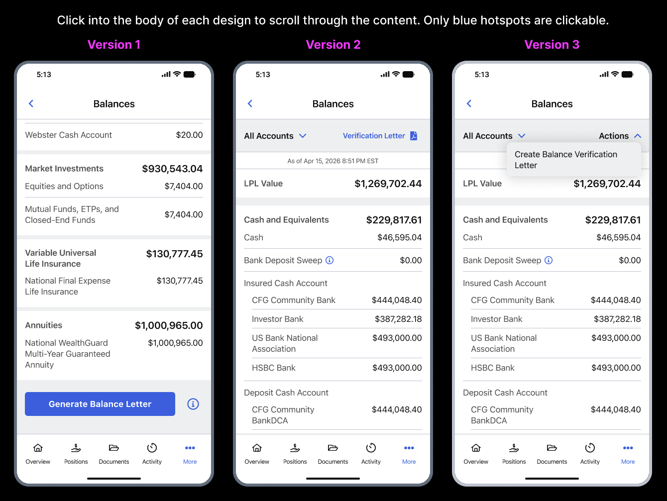
Directional synthesis from 10 transcripts comparing three Figma patterns on a
Balances-style screen: bottom CTA (V1), header-adjacent link (V2), and
Actions menu (V3). Modeled presentation after
Solvior Home 01 (Theme Junction)
— typography and palette only; content is original research.
Qualitative · n=10Figma prototypeDecision support
Methodology
Limits and how to read this
Participants explored three variants in one session. Findings describe recurring themes, not
population percentages. One participant reported non-functional hotspots in V1 — treat as a
prototype fidelity risk when comparing variants.
Do not over-generalize. Preference counts are small; use them to inform a
second iteration and a larger or counterbalanced study.
Stimulus
What participants saw
Participants received one Figma prototype showing all three versions side by side on the same
Balances screen. On-screen instructions read: “Click into the body of each design to scroll
through the content. Only blue hotspots are clickable.”
V1 — Generate Balance Letter button after scrolling all balances.
V2 — Verification Letter link in the header bar.
V3 — Actions dropdown with one item,
Create Balance Verification Letter. Select the image to view full size.
Headline results
Stated preference and tradeoffs
Stated preference leaned toward V2 (header-adjacent “verification letter”):
about seven of ten participants when counting krax5’s overall pick of V2 (krax5
also suggested borrowing V1’s clearer final-step presentation).
V1 preferred by two (RIyer, CountessFab).
V3 preferred by one (fjkii2024).
Common objections to V3: one-item Actions menu felt redundant;
prior label “Options” confused trading “options” for BeneVixit; sshapiro was less sure V3
reached a definitive “done” state.
Common objections to V1: important task buried after a long scroll (several
participants).
Core patterns
Per-version strengths and risks
V1 — Bottom CTA
Generate after scrolling balances.
Strength: Straightforward once found (CountessFab).
Strength: Success state clarity called out (uxbeforeui).
Strong pull toward Documents / statements / forms hubs; some participants
expected account settings or privacy when framing was about “sharing”
(Swen, krax5, feedbucket).
Naming the feature
Mixed support for proof of funds, balance verification letter,
account verification letter, and account valuation report. Several
participants negotiated nuance: securities vs cash, breadth beyond balance, and “verification”
sounding like password flows to a minority.
Filename customization
Majority leaned yes — especially including date and
recipient or purpose (BeneVixit, feedbucket, uxbeforeui, krax5, CountessFab). sshapiro noted
context-dependence.
Previous letters
Split: valuable for history, resend, and trend storytelling (e.g., Swen,
BeneVixit) vs low urgency if users always regenerate fresh letters (RIyer,
uxbeforeui).
Voice of the participant
Pull quotes
I prefer version two the most simply because up here at the top, it literally just has
verification letter… It gets straight to the damn point.
Swen — assets/Swen.txt
The third one is not good for me… Options can be confused with options as a derivative
instrument.
BeneVixit — assets/BeneVixit.txt
I don't see why it needs to be a menu if there's only one option.
feedbucket — assets/feedbucket.txt
I would probably go with version one… the most self-explanatory, straightforward… workflow.
RIyer — assets/RIyer.txt
Next iteration
Prioritized recommendations
Ship a header-adjacent, task-named entry (V2 pattern) as the default path for
first-time discoverability; consider a sticky or duplicated entry if the
balances list remains long.
If using Actions, ensure two or more credible actions or replace
the menu with a direct control until the roadmap catches up.
Add inline education for non-obvious controls (minimum threshold) and
audit balance header jargon (e.g., “LPL value” confusion in RIyer).
Align terminal state and copy across variants so completion is as explicit as
the clearest prototype frame (addresses sshapiro’s V3 uncertainty).
Offer smart file naming with editable filename before download (date +
recipient slug default).
Position Previous letters as a dated archive with a prominent “generate new
letter” path for users worried about stale proofs.
For the next study: counterbalance order or monadic cells; verify
hotspot parity across frames; clean moderator script wording.
Repository
Sources in this repo
assets/*.txt — verbatim transcripts
research/coded-findings.md — structured synthesis + evidence index
BVL-UT-handoff-and-findings.md — handoff for future chats